©David Sorcher 2013
©David Sorcher 2013
©David Sorcher 2013
©David Sorcher 2013
©David Sorcher 2013
©David Sorcher 2013
©David Sorcher 2013
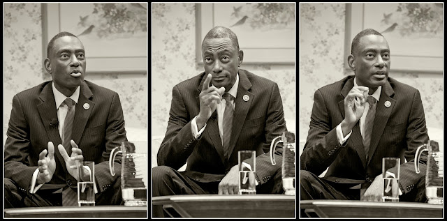
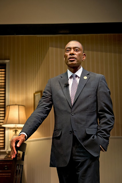
The mayor's State of the City address offered a rare opportunity to create somewhat more dramatic images of the usually run-of-the-mill political general news event. The speech took place at the Ensemble Theatre in Over-the-Rhine and the stage was set for the currently running show. Instead of a stiff podium to stand behind the mayor had a living room and dining room to work with creating both a more relaxed atmosphere and a much larger range of photographic opportunities.
©David Sorcher 2013
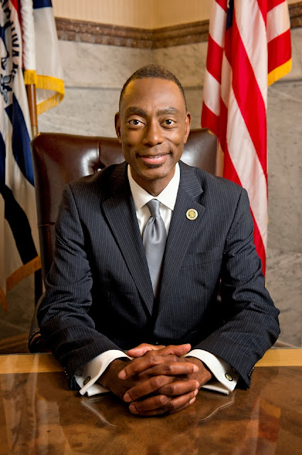
I met with the mayor at City Hall two days later for a more posed photo session. You never know what to expect in these situations. Sometimes you are luck to get just 10 minutes with your subject. I have nurtured a pretty good relationship with Mark over the past 8 years of his tenure, but even i was surprised that he was willing to give me so much of his time that day. We got the standard in-office portrait over right away. This is an image that certainly has its place, but i hoped (and was correct) that Cincy Magazine had more imagination than this and would use one of the less traditional shots from the session for print.
©David Sorcher 2013
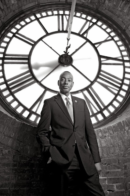
When the mayor offered to take us up into the clock tower i jumped at the chance (not realizing how much climbing was actually involved ;->). It is a location that i believe very few people have ever seen and the chance for such an unusual and graphic background was too good to pass up. The above image is the one chosen by the magazine for the main art in their article.
©David Sorcher 2013
Of course it appears more like this in the magazine. One thing i have learned, especially shooting for magazines, is that you need to give them more than a few images that can handle a good cropping. This isn't always easy for me to remember as i trained myself to be a full-frame shooter from the very start of my career, but 4 years shooting covers and second covers for CiN Weekly taught me well that designers need space for type and format. I did like the original crop with the full roundness of the clock face, but i do approve of how they handled this one and it looks great in print. They didn't go for my black & white option though which is too bad. I really did like the clock tower shots in B&W.
©David Sorcher 2013
©David Sorcher 2013
This one was my personal favorite. I understand why they chose the vertical for their purposes, but this is the most over all satisfying shot of the day for me. I am usually shocked when a publication actually chooses my personal favorite for print.
©David Sorcher 2013
I knew i wanted to do at least a few images that incorporated the beautiful stained glass in the stair well of City Hall and Cincy ran this one on the contents page.
©David Sorcher 2013
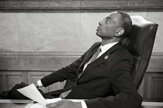
We ended our session with a few shots in council chambers where the mayor obviously spent a good deal of time over the past 8 years.
©David Sorcher 2013
Mark joked that he never liked this gavel very much and always wanted a bigger one. I'm not sure if that was needed though. He had his detractors for sure, but i watched this city grow in leaps and bounds under his leadership and after spending the entire day yesterday in council chamber watching the brand new administration "debate" the streetcar to death on their very first official business day i find myself wishing that Mark could have stuck around for just four more years. Thanks for your time and service Mark and the best of luck in whatever the future holds for you.








No comments:
Post a Comment